Saturday, March 24, 2012
A short note on gasoline prices and the election
Here is an example of fun-with-data that may not mean what the author thinks it means:
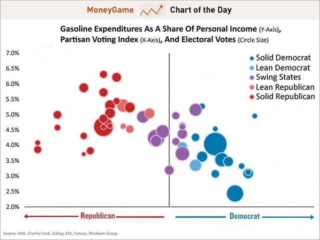
The graph appears to show a correlation between the percentage of income spent on gasoline and political inclinations. The interpretation at the link suggests cause and effect:
This graph from Trevor Houser, a partner at the Rhodium Group and an energy and natural resources specialist, appears to suggest that the relationship between voting preferences and oil is incredibly strong.Of course, it may simply be that rural states tend to be Republican states, and that greater use of gasoline and lower incomes are directly correlated with lower population density.A chart plotting political analyst Charlie Cook's Partisan Voting Index against gasoline expenditures as a share of personal income demonstrates the tight relationship between how much voters spend on gas and how they vote.
Houser explains that Republicans devote a higher share of their income to gasoline purchases than Democrats despite the fact that they actually pay less per gallon:
"It’s not the price of gasoline alone that matters to drivers, but how much they buy. And while my parents in Wyoming get the cheapest gas in the country, they have to drive six hours each way to find a half-decent shopping mall."
My own speculation is that gasoline prices have a big impact on the mood of the average person, insofar as incremental money spent on gasoline is not available for iPads, excellent cocktails, or that long-postponed trip to Branson. That sour mood works against the incumbent, regardless of party. Dubya's background as an "oil man" exposed him to tremendous criticism over high gasoline prices. Barack Obama's incessantly reinforced image as an anti-oil greenie may end up hurting him even more.
5 Comments:
By  , at
Sat Mar 24, 06:16:00 PM:
, at
Sat Mar 24, 06:16:00 PM:
This is a nice chart, but like many of its kind,
does not indication a causal relationship.
By  JC, at
Sat Mar 24, 07:49:00 PM:
JC, at
Sat Mar 24, 07:49:00 PM:
Do Democrats go Sunday driving in New York City?
JC
By , at
Sun Mar 25, 06:33:00 PM:
This is a bad graph. The x axis suggests there’s a pattern. But if you flipped it so “gas expenditures” was the x axis, most of the states would be clumped in the middle with a few outliers.
The NY Times did an analysis of “gas expenditures” as a percentage of income by county awhile back that was revealing. There are swaths of the country, and pockets in states like New York and California, where a $1.00 increase per gallon really cuts into the disposable income of the locals.
That’s why this is a big problem for Obama.
By , at
Mon Mar 26, 12:33:00 AM:
J.C.
Do Democrats go Sunday driving in New York City?
I doubt that many people drive in NYC for the pleasure of driving. It is not fun having to share the streets or expressways with millions of other drivers. Put it this way: after I drove through NYC, driving the Jersey Turnpike was a pleasure.
That is how bad it is driving in NYC.
By Assistant Village Idiot, at
Sat Mar 31, 04:27:00 PM:
Business Insider has become a joke, and this is a good example of how.
Correlation is not causation.
Correlation is not causation.
Correlation is not causation, even when it would provide evidence for a really cool point that we wish were true, so that complicated things became simple to us.
![]()