Wednesday, January 21, 2009
How the mighty have fallen
Via Paul Kedrosky, a graphic depiction of the decline in stock market value of the world's largest banks. The big blue circles are their values in the stock market in the second quarter of 2007, and the small green dots are their current market capitalizations.
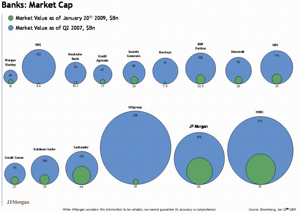
Ouch. Looked at this way, the government interventions of the last four months have barely been a "bail out," at least insofar as the stockholders are concerned.
5 Comments:
By  , at
Wed Jan 21, 11:12:00 PM:
, at
Wed Jan 21, 11:12:00 PM:
Are the figures depicted so that the *area* is proportional to the market values, or the *diameters*?
It matters a lot.
By , at
Wed Jan 21, 11:27:00 PM:
From the numbers I can discern with my old eyes and this monitor, it appear that the diagrams are drawn with respect to diameters, which makes the areas, which our minds register a good bit out of whack.
By  Simon Kenton, at
Thu Jan 22, 07:04:00 AM:
Simon Kenton, at
Thu Jan 22, 07:04:00 AM:
Good catch on the lying with graphics, gentlemen. It is diameters. Imagine how woeful it would have looked on a log scale.
By , at
Thu Jan 22, 12:01:00 PM:
Since it is diameters, these graphs are fraudulent. It's like saying, "Bank of Foo lost 100 million dollars SQUARED!!".
By E Hines, at
Fri Jan 23, 12:20:00 PM:
OP's reference appears to assume, erroneously, that the government (read: taxpayer) bailout should have occurred at all.
![]()